
Note
Click here to download the full example code or to run this example in your browser via Binder
Regression
The following example shows how to fit a simple regression model with auto-sklearn.
from pprint import pprint

import sklearn.datasets
import sklearn.metrics

import autosklearn.regression
import matplotlib.pyplot as plt
Data Loading
X, y = sklearn.datasets.load_diabetes(return_X_y=True)

X_train, X_test, y_train, y_test = sklearn.model_selection.train_test_split(
    X, y, random_state=1
)
Build and fit a regressor
automl = autosklearn.regression.AutoSklearnRegressor(
    time_left_for_this_task=120,
    per_run_time_limit=30,
    tmp_folder="/tmp/autosklearn_regression_example_tmp",
)
automl.fit(X_train, y_train, dataset_name="diabetes")
AutoSklearnRegressor(ensemble_class=<class 'autosklearn.ensembles.ensemble_selection.EnsembleSelection'>,
                     per_run_time_limit=30, time_left_for_this_task=120,
                     tmp_folder='/tmp/autosklearn_regression_example_tmp')
View the models found by auto-sklearn
print(automl.leaderboard())
          rank  ensemble_weight               type      cost  duration
model_id
25           1             0.46                sgd  0.436679  0.701417
6            2             0.32     ard_regression  0.455042  0.779423
27           3             0.14     ard_regression  0.462249  0.826378
11           4             0.02      random_forest  0.507400  9.763534
7            5             0.06  gradient_boosting  0.518673  1.450713
Print the final ensemble constructed by auto-sklearn
pprint(automl.show_models(), indent=4)
{   6: {   'cost': 0.4550418898836528,
           'data_preprocessor': <autosklearn.pipeline.components.data_preprocessing.DataPreprocessorChoice object at 0x7f05d6018550>,
           'ensemble_weight': 0.32,
           'feature_preprocessor': <autosklearn.pipeline.components.feature_preprocessing.FeaturePreprocessorChoice object at 0x7f05d0fc0ee0>,
           'model_id': 6,
           'rank': 1,
           'regressor': <autosklearn.pipeline.components.regression.RegressorChoice object at 0x7f05d0fc0c40>,
           'sklearn_regressor': ARDRegression(alpha_1=0.0003701926442639788, alpha_2=2.2118001735899097e-07,
              copy_X=False, lambda_1=1.2037591637980971e-06,
              lambda_2=4.358378124977852e-09,
              threshold_lambda=1136.5286041327277, tol=0.021944240404849075)},
    7: {   'cost': 0.5186726734789994,
           'data_preprocessor': <autosklearn.pipeline.components.data_preprocessing.DataPreprocessorChoice object at 0x7f05d463fa60>,
           'ensemble_weight': 0.06,
           'feature_preprocessor': <autosklearn.pipeline.components.feature_preprocessing.FeaturePreprocessorChoice object at 0x7f05d11a2820>,
           'model_id': 7,
           'rank': 2,
           'regressor': <autosklearn.pipeline.components.regression.RegressorChoice object at 0x7f05d11a2f10>,
           'sklearn_regressor': HistGradientBoostingRegressor(l2_regularization=1.8428972335335263e-10,
                              learning_rate=0.012607824914758717, max_iter=512,
                              max_leaf_nodes=10, min_samples_leaf=8,
                              n_iter_no_change=0, random_state=1,
                              validation_fraction=None, warm_start=True)},
    11: {   'cost': 0.5073997164657239,
            'data_preprocessor': <autosklearn.pipeline.components.data_preprocessing.DataPreprocessorChoice object at 0x7f05d6403b80>,
            'ensemble_weight': 0.02,
            'feature_preprocessor': <autosklearn.pipeline.components.feature_preprocessing.FeaturePreprocessorChoice object at 0x7f05d6140640>,
            'model_id': 11,
            'rank': 3,
            'regressor': <autosklearn.pipeline.components.regression.RegressorChoice object at 0x7f05d6140160>,
            'sklearn_regressor': RandomForestRegressor(bootstrap=False, criterion='mae',
                      max_features=0.6277363920171745, min_samples_leaf=6,
                      min_samples_split=15, n_estimators=512, n_jobs=1,
                      random_state=1, warm_start=True)},
    25: {   'cost': 0.43667876507897496,
            'data_preprocessor': <autosklearn.pipeline.components.data_preprocessing.DataPreprocessorChoice object at 0x7f05d0fc0130>,
            'ensemble_weight': 0.46,
            'feature_preprocessor': <autosklearn.pipeline.components.feature_preprocessing.FeaturePreprocessorChoice object at 0x7f05d10363d0>,
            'model_id': 25,
            'rank': 4,
            'regressor': <autosklearn.pipeline.components.regression.RegressorChoice object at 0x7f05d1036f70>,
            'sklearn_regressor': SGDRegressor(alpha=0.0006517033225329654, epsilon=0.012150149892783745,
             eta0=0.016444224834275295, l1_ratio=1.7462342366289323e-09,
             loss='epsilon_insensitive', max_iter=16, penalty='elasticnet',
             power_t=0.21521743568582094, random_state=1,
             tol=0.002431731981071206, warm_start=True)},
    27: {   'cost': 0.4622486119001967,
            'data_preprocessor': <autosklearn.pipeline.components.data_preprocessing.DataPreprocessorChoice object at 0x7f05d462eb20>,
            'ensemble_weight': 0.14,
            'feature_preprocessor': <autosklearn.pipeline.components.feature_preprocessing.FeaturePreprocessorChoice object at 0x7f05d5ff7940>,
            'model_id': 27,
            'rank': 5,
            'regressor': <autosklearn.pipeline.components.regression.RegressorChoice object at 0x7f05d5ff71c0>,
            'sklearn_regressor': ARDRegression(alpha_1=2.7664515192592053e-05, alpha_2=9.504988116581138e-07,
              copy_X=False, lambda_1=6.50650698230178e-09,
              lambda_2=4.238533890074848e-07,
              threshold_lambda=78251.58542976103, tol=0.0007301343236220855)}}
Get the Score of the final ensemble
After training the estimator, we can now quantify the goodness of fit. One possibility for is the R2 score. The values range between -inf and 1 with 1 being the best possible value. A dummy estimator predicting the data mean has an R2 score of 0.
train_predictions = automl.predict(X_train)
print("Train R2 score:", sklearn.metrics.r2_score(y_train, train_predictions))
test_predictions = automl.predict(X_test)
print("Test R2 score:", sklearn.metrics.r2_score(y_test, test_predictions))
Train R2 score: 0.5944780427522034
Test R2 score: 0.3959585042866587
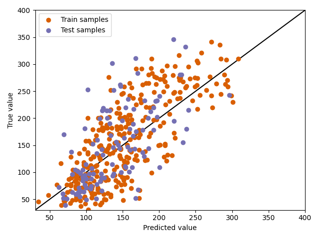
Plot the predictions
Furthermore, we can now visually inspect the predictions. We plot the true value against the predictions and show results on train and test data. Points on the diagonal depict perfect predictions. Points below the diagonal were overestimated by the model (predicted value is higher than the true value), points above the diagonal were underestimated (predicted value is lower than the true value).
plt.scatter(train_predictions, y_train, label="Train samples", c="#d95f02")
plt.scatter(test_predictions, y_test, label="Test samples", c="#7570b3")
plt.xlabel("Predicted value")
plt.ylabel("True value")
plt.legend()
plt.plot([30, 400], [30, 400], c="k", zorder=0)
plt.xlim([30, 400])
plt.ylim([30, 400])
plt.tight_layout()
plt.show()
Total running time of the script: ( 2 minutes 3.004 seconds)